
Carousel (with hide functionality) (#14)
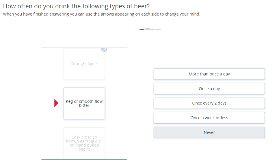
For this question, copy the below question and update question label, question text, row text and column text accordingly.
Note: Make sure the rows have label starting with "r" (e.g. r1, r2, etc.) and columns have label starting with "c" (e.g. c1, c2, etc.)
<radio
label="jGTT001_2"
fir="off"
randomize="0">
<title>How often do you drink the following types of beer?</title>
<comment>When you have finished answering you can use the arrows appearing on each side to change your mind.</comment>
<row label="r1">Draught lager</row>
<row label="r2">Keg or smooth flow bitter</row>
<row label="r3">Cask ale (also known as "real ale" or "hand pulled beer")</row>
<row label="r4">Guinness (or other stout)</row>
<col label="c1" value="1">More than once a day</col>
<col label="c2" value="2">Once a day</col>
<col label="c3" value="3">Once every 2 days</col>
<col label="c4" value="4">Once a week or less</col>
<col label="c99" value="99">Never</col>
<style name="page.head"><![CDATA[
<style>.answers{display:none;}</style>
]]></style>
<style name="question.after"><![CDATA[
<style>.answers{visibility:hidden;}</style>
<script type="text/javascript" src="${KEDomain}/core/legacytool/application_decipher_v2.0.js"></script>
<script type="text/javascript">
var coffeebeans;
(function (coffeebeans) {
if (!coffeebeans.qDefs)
coffeebeans.qDefs = {};
coffeebeans.qDefs["${this.label}"] = ${jsexport()};
$ (document).ready(function(){
if ($ ('.colGroup').length) $ ('.colGroup').remove();
parseJsexportData();
});
})(coffeebeans || (coffeebeans = {}));
</script>
<div class="gridclick" style="margin-bottom:50px"><img class="img-responsive loading-container" style="margin: 40px auto;" src="${KEDomain}/core/images/curve.gif" /><div class="gridclick-container"></div></div>
<link rel="stylesheet" type="text/css" href="${KEDomain}/tools/legacy_carousel/gridClick.min.css">
<link rel="stylesheet" type="text/css" href="${KEDomain}/core/ionicons/ionicons.min.css">
<link rel="stylesheet" type="text/css" href="${KEDomain}/tools/legacy_carousel/jquery.fancybox.css">
<script type="text/javascript" src="${KEDomain}/tools/legacy_carousel/gridClick.min.js"></script>
<script type="text/javascript" src="${KEDomain}/tools/legacy_carousel/jquery.fancybox.js"></script>
<script type="text/javascript">
$ (function() {
var config = {
sForm : getFormName(1), // form name of the grid
sSplitter : '$', // splitter for images
sOrientation : 'vertical', // 'horizontal', 'vertical'
sProgressSepText : ' / ', // separator text between item progress
sTxtProgress : '', // text after progress text
sForwardButton : '#btn_continue', // forward button jQuery selector - used for toggling the next button
sOeDefaultHolder: '........', // default input placeholder when OEs are present
sHideScaleType : 'keepAlignment', // method to hide the scales - 'keepAlignment', 'newAlignment'
sDkScaleBgColor : '#E9ECEF', // background color for the DK scale
iMinItemsRequired : null, // minimum answered items required to toggle the next button - default is null - all required
iAnimationTime : 400, // animation time in ms
iMaxContainerWidth : 750, // maximum tool container width - can be used to enlarge/shrink the tool
iVertItemContainPerc : 45, // vertical item container percentage width
iVertItemContainMarginPerc : 5, // vertical item container percentage margin
iFontSize : null, // font size for the tool container
aDkScale : [99], // dk codes for scale - for example: [99,999]
aOtherNotRequired : [], // other not required item codes - for example: [99,999]
aOtherPlaceHolder : [], // other input custom placeholder - for example [{'98': 'Please specify'}, {'998': 'Specify'}]
aOtherOpenOptional: [], // other OE input not required - next button will be toggled without the need of OE input - scale can still be chosen - for example: [98, 998]
aHideScaleCodes: [{3: [1,3]}], // hide scales for specific codes [{98: [1,3]}, {1: [2,4]}]
oElementConfig : { // element/item config object
bImages : false, // images as options - using the splitter
bShowLabel : true, // show labels for the options
bShowOeImage : false, // if OE - should it show an image for the other option
bZoomEnabled : false, // is zoom enabled
sZoomImage : '${KEDomain}/tools/images/mag.png', // zoom icon image path
sZoomPosition : 'br', // position for the zoom icon - 'br', 'bl', 'tl'
sImagePath : '', // path for the images to be used with the splitter
sSmallImageExtension : '_S.png', // extension for the small image (default shown)
sLargeImageExtension : '_L.png', // extension for the zoomed image
iMaxImageWidth: 100, // maximum image width - needs to be lower than iWidth
iMaxImageHeight: 100, // maximum image height - needs to be lower than iHeight
iWidth : 130, // overall item container width
iHeight : 100, // overall item container height
iHorizontalSpacing : 5, // horizontal spacing between items
iVerticalSpacing : 25, // vertical spacing between items
iFontSize: null // font size for the item container
},
oScaleConfig : { // scale config object
bImages : false, // images as options - using the splitter
bShowLabel : true, // show labels for the options
bZoomEnabled : false, // is zoom enabled
sZoomImage : '${KEDomain}/tools/images/mag.png', // zoom icon image path
sZoomPosition : 'br', // position for the zoom icon - 'br', 'bl', 'tl'
sImagePath : '', // path for the images to be used with the splitter
sSmallImageExtension : '.png', // extension for the small image (default shown)
sLargeImageExtension : '.png', // extension for the zoomed image
iMaxImageWidth: 62, // maximum image width - needs to be lower than iWidth
iMaxImageHeight: 62, // maximum image height - needs to be lower than iHeight
iWidth : 350, // scale button width
iHeight : 35, // scale button height
iHorizontalSpacing : 10, // horizontal scale spacing
iVerticalSpacing : 10, // vertical scale spacing
iFontSize: null // font size for the scale container
},
oFancyBoxConfig : {}, // config for adding custom fancybox parameters - //fancyapps.com/fancybox/3/docs/
bInvertItemScale : false, // invert the item/scale containers - top/bottom for horizontal, left/right for vertical
bHeightAuto : false, // make the items/scales have auto height for horizontal view - should not be used for vertical
bScaleNewLine: false, // make the scale in horizontal mode render vertically (one below the other) when not enough horizontal space for all scales
bReverse : true, // reverse the direction of the items/navigation arrows
bShowProgressText : false, // show the progress text progress
bShowProgressIndicator : true, // show the progress indicator
bDisableNavigation : false, // disable navigation arrows - will only be allowed for multi or when no AutoNext item is false
bAutoNextItem : true, // automatically go to next item when selected - working on multi only when DK scale is selected
bAutoSubmit : false, // auto submit page when all items are answered
bInitialNavigation : false, // initial navigation toggle
bEnableNavAnswered : false, // Enable navigation for already answered items only. Not applicable when bDisableNavigation or bInitialNavigation is enabled
bMultiple : false, // is the grid multiple
bAutoSizeScales : false, //Automatically re-render scales to fit the width. Not applicable when bScaleNewLine is enabled or when oScaleConfig.iFirstLastWidth is set.
bIsTest : true, // will make the tool warning appear as JavaScript alerts to make sure they are handled
onStart : function() {}, // function called before the tool starts generating
onAnswer : function(e) {}, // function called when an answer is given (click on scale)
onInput : function(e) {}, // function called on OE input (item)
onCompleted : function() {}, // function called when all items are answered (unless OE not required codes are defined) before next button is toggled
onReady : function() {
$ ('.answers').hide();
}, // function called after tool is fully loaded
}
$ ('body').gridClick(config);
});
</script>
${initkelegacyDataToggle()}
]]></style>
</radio>
<suspend/>General Instructions for all ketool setups
For all ketool setup, please implement the below
<exec when="init">
KEDomain = "https://au.focusvision.com/survey/selfserve/560/221003"
project_id = gv.survey.path

def initKEToggleData():
  returntext = "\n var dataToggler = jQuery('<div>For testing only - click here to expand data capturing nodes to verify the data capture during test mode.</div>');\n"
  returntext += "dataToggler.addClass('dataToggle');\n"
  returntext += "dataToggler.css({'text-decoration': 'underline','font-size': 'small','color': 'blue','cursor': 'pointer','margin-top': '20px'});\n"
  returntext += "jQuery('.ketool-stage').last().after(dataToggler);\n"
  returntext += "dataToggler.click(info.bridge.toggleDataNodes());\n"
  return returntext

def initkelegacyDataToggle():
  if gv.isUser() and not gv.debug.respview:
    output = "<script>\n"
    output += "var dataToggler = jQuery('<div>Please click here to see the data nodes for this tool.</div>');\n"
    output += "dataToggler.addClass('dataToggle');\n"
    output += "dataToggler.css({'text-decoration': 'underline','font-size': 'small','color': 'blue','cursor': 'pointer','margin-top': '20px'});\n"
    output += "dataToggler.click(kelegacyDataToggle);\n"
    output += "function kelegacyDataToggle(){ if(jQuery('.survey-page').hasClass('showkelegacyData')) jQuery('.survey-page').removeClass('showkelegacyData'); else jQuery('.survey-page').addClass('showkelegacyData');  }\n"
    output += "jQuery(function(){jQuery ('.survey-buttons').before(dataToggler); })\n"
    output += "</script>\n"
    output += "<style>.showkelegacyData .answers,.showkelegacyData .question{display: block !important;visibility: visible !important;}</style>\n"
    return output
  else:
    return ""
</exec>
Carousel (with hide functionality) (#14)
Below are the parameters for the Carousel tool :
| Tool Settings | Use | Value Type / Syntax | Default Value / Possible Values | |
|---|---|---|---|---|
| sSplitter | splitter for images | string |
|
|
| sOrientation | Layout of cards in carousel | fixed string | Possible values: ["horizontal","vertical"] | |
| sProgressSepText | separator text between item progress | string | / | |
| sTxtProgress | text after progress text | string |
|
|
| sForwardButton | forward button jQuery selector - used for toggling the next button | string | #btn_continue (DO NOT CHANGE) | |
| sDeDefaultHolder | default input placeholder when OEs are present | string | ........ | |
| sHideScaleType | method to hide the scales - 'keepAlignment', 'newAlignment' | string | Default value: keepAlignment
Possible values: ["keepAlignment "," newAlignment"] |
|
| sDkScaleBgColor | background color for the DK scale | String (hex code) | #E9ECEF | |
| iMinItemsRequired | minimum answered items required to toggle the next button - default is null - all required | Number > 0 or null | null | |
| iAnimationTime | animation time in ms | Number > 0 | 400 | |
| iMaxContainerWidth | maximum tool container width - can be used to enlarge/shrink the tool | String (for width in px) | 750 | |
| iVertItemContainPerc | vertical item container percentage width | String (for width in %) | 45 | |
| vertical item container percentage margin | String (for margin in %) | 5 | ||
| iFontSize | font size for the tool container | String (for font-size) or null | Null | |
| aDkScale | dk codes for scale | String (in fixed format) | e.g. [99, 999] | |
| aOtherNotRequired | other not required item codes | String (in fixed format) | e.g. [99, 999] | |
| aOtherPlaceHolder | other input custom placeholder | String (in fixed format) | e.g. [{'98': 'Please specify'}, {'998': 'Specify'}] | |
| aOtherOpenOptional | other OE input not required - next button will be toggled without the need of OE input - scale can still be chosen | String (in fixed format) | e.g. [98, 998] | |
| aHideScaleCodes | hide scales for specific codes | String (in fixed format) | e.g. [{98: [1,3]}, {1: [2,4]}] | |
| fancyBoxConfig | Overwriting the default/set by the tool parameters. More information on the possible parameters - https://fancyapps.com/fancybox/3/docs/#options | object |
|
|
| middleTemplate | Custom HTML template to be used for the middle part of the Shelf item markup. | string |
|
|
| bottomTemplate | Custom HTML template to be used for the bottom part of the Shelf item markup. | string |
|
|
| zoomPosition | Position of the zoom button. | fixed string | Default value: bottom-right
Possible values: ["bottom-right","top-right","bottom-left","top-left"] |
|
| oScaleConfig
(scale config object) |
bImages | images as options - using the splitter | String (or false in case no images)) | false |
| bShowLabel | show labels for the options | boolean | false | |
| bZoomEnabled | is zoom enabled | boolean | true | |
| sZoomImage | zoom icon image path | string | Image URL | |
| sZoomPosition | position for the zoom icon - 'br', 'bl', 'tl' | Fixed string | br (bottom right), bl (bottom left), tl (top left) | |
| sImagePath | path for the images to be used with the splitter | string |
|
|
| sSmallImageExtension | extension for the small image (default shown) | string (for extension) | .png | |
| sLargeImageExtension | extension for the zoomed image | string (for extension) | .png | |
| iMaxImageWidth | maximum image width - needs to be lower than iWidth | String (for width in px) | 62 | |
| iMaxImageHeight | maximum image height - needs to be lower than iHeight | String (for width in px) | 62 | |
| iWidth | scale button width | String (for width in px) | 350 | |
| iHeight | scale button height | String (for width in px) | 35 | |
| iHorizontalSpacing | horizontal scale spacing | String (for width in px) | 10 | |
| iVerticalSpacing | vertical scale spacing | String (for width in px) | 10 | |
| iFontSize | font size for the scale container | String (for font-size) or null | null | |
| oElementConfig
(element/item config object) |
bImages | images as options - using the splitter | String (or false in case no images)) | false |
| bShowLabel | show labels for the options | boolean | true | |
| bShowOeImage | if OE - should it show an image for the other option | boolean | false | |
| bZoomEnabled | is zoom enabled | string | false | |
| sZoomImage | zoom icon image path | string | Image URL | |
| sZoomPosition | position for the zoom icon - 'br', 'bl', 'tl' | Fixed string | br (bottom right), bl (bottom left), tl (top left) | |
| sImagePath | path for the images to be used with the splitter | string |
|
|
| sSmallImageExtension | extension for the small image (default shown) | string (for extension) | e.g. “_S.png” | |
| sLargeImageExtension | extension for the zoomed image | string (for extension) | e.g. “_L.png” | |
| iMaxImageWidth | maximum image width - needs to be lower than iWidth | String (for width in px) | 100 | |
| iMaxImageHeight | maximum image height - needs to be lower than iHeight | String (for width in px) | 100 | |
| iWidth | overall item container width | String (for width in px) | 130 | |
| iHeight | overall item container height | String (for width in px) | 100 | |
| iHorizontalSpacing | horizontal spacing between items | String (for width in px) | 5 | |
| iVerticalSpacing | vertical spacing between items | String (for width in px) | 25 | |
| iFontSize | font size for the item container | String (for font-size) or null | null | |
| oFancyBoxConfig | config for adding custom fancybox parameters - //fancyapps.com/fancybox/3/docs/ | In fixed format |
|
|
| bInvertItemScale | invert the item/scale containers - top/bottom for horizontal, left/right for vertical | boolean | false | |
| bHeightAuto | make the items/scales have auto height for horizontal view - should not be used for vertical | boolean | false | |
| bScaleNewLine | make the scale in horizontal mode render vertically (one below the other) when not enough horizontal space for all scales | boolean | false | |
| bReverse | reverse the direction of the items/navigation arrows | boolean | true | |
| bShowProgressText | show the progress text progress | boolean | false | |
| bShowProgressIndicator | show the progress indicator | boolean | true | |
| bDisableNavigation | disable navigation arrows - will only be allowed for multi or when no AutoNext item is false | boolean | false | |
| bAutoNextItem | automatically go to next item when selected - working on multi only when DK scale is selected | boolean | true | |
| bAutoSubmit | auto submit page when all items are answered | boolean | false | |
| bInitialNavigation | initial navigation toggle | boolean | false | |
| bEnableNavAnswered | Enable navigation for already answered items only. Not applicable when bDisableNavigation or bInitialNavigation is enabled | boolean | false | |
| bMultiple | is the grid multiple | boolean | false | |
| bAutoSizeScales | Automatically re-render scales to fit the width. Not applicable when bScaleNewLine is enabled or when oScaleConfig.iFirstLastWidth is set. |
|
|
|
| bIsTest | will make the tool warning appear as JavaScript alerts to make sure they are handled | boolean | false | |
| onStart | function called before the tool starts generating | JS/jQuery code |
|
|
| onAnswer | function called when an answer is given (click on scale) | JS/jQuery code |
|
|
| onInput | function called on OE input (item) | JS/jQuery code |
|
|
| onCompleted | function called when all items are answered (unless OE not required codes are defined) before next button is toggled | JS/jQuery code |
|
|
| onReady | function called after tool is fully loaded | JS/jQuery code |
|
|