
Slider based Ranking Setup (#8)
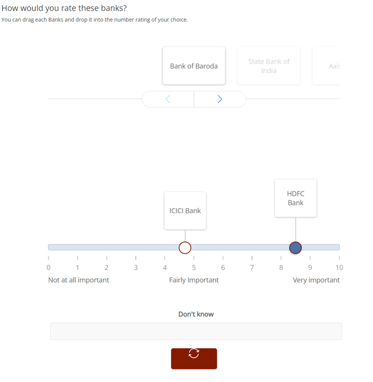
For this question, a float question will be implemented and the below code will be placed into it. In case it is ranking question, the “_order” question should also be implemented.
  <float
   label="ketoolSliderRankingNum"
   fir="off"
   optional="0"
   randomize="0"
   range="0,999"
   size="5">
    <title>How would you rate these banks?</title>
    <comment>You can drag each Banks and drop it into the number rating of your choice.</comment>
    <row label="r1">ICICI Bank</row>
    <row label="r2">HDFC Bank</row>
    <row label="r3">Bank of Baroda</row>
    <row label="r4">State Bank of India</row>
    <row label="r5">Axis Bank</row>
    <style name="page.head"><![CDATA[
<style>
  .answers{display:none;}
  #btn_continue {
    visibility: hidden;
  }
</style>
]]></style>
    <style name="question.after"><![CDATA[
<div class="ketool-stage" id= "ketool-stage-${this.label}" style="margin-top: -30px;"></div>

    <script type="text/javascript" crossorigin="anonymous" src="${KEDomain}/framework.min.js"></script>

    <script type="text/javascript">


      if (!ketool.qDefs)
        ketool.qDefs = {};
      if (!ketool.toolLoader) {
        ketool.toolLoader = new ketool.Loader({
            "baseFileURL": "${KEDomain}/",
            "scriptDeps": [
                "fancyboxlib.js",
                "Slider_libs.js",
              "jquery-ui.min.js",
              "jquery.ui.touch-punch.min.js",
              "Carousel_libs.js",
              "Carousel.js"
            ],
            "cssDeps": [
                "ionicons.min.css",
                "libs_fancybox.css",
                "Slider_libs.css",

                "style_framework.css",
                "Carousel_libs.css",
                "Carousel.css",
                "keBrown.css"
            ],
            "coreFile": "core_app.js",
            "messages": null,
            "platformInterface": { js: "platform_app.js", css: "platform_style.css" }
                                        });
      }
      ketool.qDefs["${this.label}"] = ${jsexport()};
      var isTest = "${gv.isUser() and not gv.debug.respview}" === "True";


   //SETTINGS AND STUFF GOES HERE
      var toolSettings = {
        //standard tool params
        "toolJs": "slider_rank.js",
        "toolName": "SliderBasedRankingApp",
        "jsToLoad": [],
        "cssToLoad": ["slider_rank.css"],
        "baseToolPath": "${KEDomain}/",
        "container": "#ketool-stage-" + getFormName(1),
        "toolCssNames": [],
        "qid": "${this.label}",
        "time_qid": "${this.label}_Time",
        "order_qid": "${this.label}_Order",
        "imageBaseURL": "${KEDomain}/",
        "minRequired": ${len(this.rows)},
        "maxAllowed": ${len(this.rows)},
        "numDecimalsTimeData": 2,
        //end standard tool params
        "leftContent": "Not at all important",
        "midContent": "Fairly Important",
        "rightContent": "Very important",
        "snapping": false,
        "rtlMode": false,
        "scalePrefix": "",
        "scaleSuffix": "",
        "numDecimals": 1,
        "showTicks": true,
        "showTickLabels": true,
        "showMidTicks": false,
        "showGrabberValue": false,
        "stickyGrabberValue": true,
        "disabled": false,
        "badValueError": "<*vre*>",
        "respectDistance": true, // If set to true, the distance between scales will be relative to the difference between the scale values. Otherwise, distance will just be equal.
        "nonGridSetting": {
            min: 0,
            max: 10,
            increment: 0.1,
            exclusives: [{
              precode: 999,
              content: "Don't know",
              width: "100%",
              height: "40px"
            }],
        },
        "cardLayout": "carousel",
        "carouselSettings": {
            "numCardsCarousel": 1,
            "animationSpeed": 300,
            "itemMargin": 30
        },
        "answerItemConfig": {
          "width": 150,
          "height": 90,
          "droppedWidth": 100,
          "droppedHeight": 90
        },
        "resetSettings": {
            content: "",
            width: "110px",
            height: "50px",
            icon: "${KEDomain}/reset_slider.svg"
        },
        "noUiSliderParams": {},
        "showProgressBar": false,
        "showZoom": true,
        "zoomButtonImage": "${KEDomain}/mag9.png",
        "zoomPosition": "bottom-right",
        "sliderDropAreaHeight": 350,
        "isRanking": false,
        "duplicateError": "Please make sure you don't have any duplicate rating.",
        "customValidation": function (q) {
            console.log("customValidation()", q);
            return true;
        }
      };

      ketool.toolLoader.registerSettings(toolSettings, function (info) {
          console.log("Questions loaded");
          console.log(info.bridge.exportQuestions());
          console.log(info);

          info.instance.setToolValidation(toolSettings.customValidation);

          info.bridge.setPageValidation(function(){
              console.log("setPageValidation");
              return true;
          });

          info.instance.on("tool_loaded", function(e){
            //console.log("tool_loaded", e);
            if(isTest){
                ${initKEToggleData()}
            }
          });
      });
      //END USER EDITABLE CODE

      $ (document).ready(function(){
        ketool.toolLoader.initLoad();


    });
    </script>

    <style>
      /* --- Override default Decipher styles --- */

.ketool-container .openbox-container textarea {min-width: auto !important;}
.ketool-sliderapp-horizontal.ketool-sliderapp-sbr .ketool-sliderapp-reset-holder .ketool-sliderapp-reset-button .ketool-btn-label>div {width: 100%;position: relative;top: calc(50% - 15px);}

      /* --- End Override default Decipher styles --- */
    </style>
]]></style>
  </float>

  <float
   label="ketoolSliderRankingNum_Time"
   fir="off"
   translateable="0">
    <title>Data node for time data. ketoolSliderRankingNum_Time.</title>
    <row label="r1">ICICI Bank{@imageURL::bank_1.png||largeImageURL::bank_1_L.png||width::130px||height::170px@}</row>
    <row label="r2">HDFC Bank{@imageURL::bank_2.png||largeImageURL::bank_2_L.png||width::130px||height::170px@}</row>
    <row label="r3">Bank of Baroda{@imageURL::bank_3.png||largeImageURL::bank_3_L.png||width::130px||height::170px@}</row>
    <row label="r4">State Bank of India{@imageURL::bank_4.png||largeImageURL::bank_4_L.png||width::130px||height::170px@}</row>
    <row label="r5">Axis Bank{@imageURL::bank_5.png||largeImageURL::bank_5_L.png||width::130px||height::170px@}</row>
    <style name="question.after"><![CDATA[
<script>
        if (!ketool.qDefs)
            ketool.qDefs = {};

        ketool.qDefs["${this.label}"] = ${jsexport()};
    </script>
]]></style>
  </float>

  <float
   label="ketoolSliderRankingNum_Order"
   fir="off"
   translateable="0">
    <title>Data node for order data. ketoolSliderRankingNum_Time.</title>
    <row label="r1">ICICI Bank{@imageURL::bank_1.png||largeImageURL::bank_1_L.png||width::130px||height::170px@}</row>
    <row label="r2">HDFC Bank{@imageURL::bank_2.png||largeImageURL::bank_2_L.png||width::130px||height::170px@}</row>
    <row label="r3">Bank of Baroda{@imageURL::bank_3.png||largeImageURL::bank_3_L.png||width::130px||height::170px@}</row>
    <row label="r4">State Bank of India{@imageURL::bank_4.png||largeImageURL::bank_4_L.png||width::130px||height::170px@}</row>
    <row label="r5">Axis Bank{@imageURL::bank_5.png||largeImageURL::bank_5_L.png||width::130px||height::170px@}</row>
    <style name="question.after"><![CDATA[
<script>
        if (!ketool.qDefs)
            ketool.qDefs = {};

        ketool.qDefs["${this.label}"] = ${jsexport()};
    </script>
]]></style>
  </float>
General Instructions for all ketool setups
For all ketool setup, please implement the below
<exec when="init">
KEDomain = "https://au.focusvision.com/survey/selfserve/560/221003"
project_id = gv.survey.path

def initKEToggleData():
  returntext = "\n var dataToggler = jQuery('<div>For testing only - click here to expand data capturing nodes to verify the data capture during test mode.</div>');\n"
  returntext += "dataToggler.addClass('dataToggle');\n"
  returntext += "dataToggler.css({'text-decoration': 'underline','font-size': 'small','color': 'blue','cursor': 'pointer','margin-top': '20px'});\n"
  returntext += "jQuery('.ketool-stage').last().after(dataToggler);\n"
  returntext += "dataToggler.click(info.bridge.toggleDataNodes());\n"
  return returntext

def initkelegacyDataToggle():
  if gv.isUser() and not gv.debug.respview:
    output = "<script>\n"
    output += "var dataToggler = jQuery('<div>Please click here to see the data nodes for this tool.</div>');\n"
    output += "dataToggler.addClass('dataToggle');\n"
    output += "dataToggler.css({'text-decoration': 'underline','font-size': 'small','color': 'blue','cursor': 'pointer','margin-top': '20px'});\n"
    output += "dataToggler.click(kelegacyDataToggle);\n"
    output += "function kelegacyDataToggle(){ if(jQuery('.survey-page').hasClass('showkelegacyData')) jQuery('.survey-page').removeClass('showkelegacyData'); else jQuery('.survey-page').addClass('showkelegacyData');  }\n"
    output += "jQuery(function(){jQuery ('.survey-buttons').before(dataToggler); })\n"
    output += "</script>\n"
    output += "<style>.showkelegacyData .answers,.showkelegacyData .question{display: block !important;visibility: visible !important;}</style>\n"
    return output
  else:
    return ""
</exec>
We also have few general options in all ketool setups with function “initKEToggleData” is being called, which should not be changed, these are:
- toolJs: This option contains the name of js file for respective tool
- toolName: This option contains the name of tool
- jsToLoad: This option contains the name(s) of additional js file(s) to load for respective tool
- cssToLoad: This option contains the name(s) of css file for respective tool
- baseToolPath: This option stores the path where any of the above files are stored
- container: This contains the id for calling the div where the tool is rendered
- qid: This stores the current question label to refer
These options are optional and should only be implemented if needed:
- time_qid: This option stores the question label where the time spent on each option (in case it is needed) is stored
- order_qid: This option stores the question label where the order in which an option is answered is stored
- numDecimalsTimeData: This stores the decimal places for the data stored in time spent question
- customValidation: Can be used to specify any custom validation using js
- answerItemConfig: Have the below values which can be used to determine the appearance of the question:
- width: This option stores the width occupied by the question
- numItemsPerRow: Has 3 options below based on screen sizes:
- small: Here we can specify the number if items shown in a row (i.e. horizontally) on small screens (such as few tablets and all phones)
- medium: Here we can specify the number if items shown in a row (i.e. horizontally) on medium screens (such as few tablets and some laptops/desktops with small screen size/resolution)
- large: Here we can specify the number if items shown in a row (i.e. horizontally) on large screens (such as laptops/desktops with large screen size/resolution)
- imageBaseURL: This stores the path for all the images used in the setup (so images can just be called by their name if this is specified
For any follow-up question (including “_time”, “_order” questions) should include the below code:
<exec when="init">
<style name="question.after"><![CDATA[
<script type='text/javascript'>if (ketool.qDefs) ketool.qDefs["${this.label}"] = ${jsexport()};</script>
]]></style>
Slider based Ranking Setup settings (#8)
Below are the tool settings, row and scale options to be used for slider based ranking setup:
| Tool Settings | Use | Value Type / Syntax | Default Value / Possible Values | |||
|---|---|---|---|---|---|---|
| minRequired | The number of items that must be answered for the user to proceed. Setting this to null means that all items must be answered. | Number > 0 or blank/null | null/blank | |||
| maxAllowed | The maximum number of items that can be answered. | Number > 0 | 999 | |||
| numDecimalsTimeData | The number of decimal places that the time data should be rounded to. E.g. set to 2 for two decimal places - 2.73. | Number > 0 | 0 | |||
| snapping | Whether the slider grabbers snap to scale tick marks, or can be dragged anywhere on the slider. Snapping will always be true for grid sliders. | boolean | true | |||
| rtlMode | Whether the tool should be displayed in right-to-left mode (for arabic surveys). | boolean | true | |||
| scalePrefix | Text to insert before all scale labels. | string |
|
|||
| scaleSuffix | Text to insert after all scale labels. | string |
|
|||
| numDecimals | The number of decimal places that will be shown for the slider grabber values. | Number > 0 |
|
|||
| decimalSign | The delimiter used to indicate a decimal place - e.g. "," or "." . | string | . | |||
| showGrabber | Whether to show the circular element that's part of the handle. | boolean | true | |||
| showGrabberValue | Whether to show the grabber / item value. | boolean | false | |||
| stickyGrabberValue | If this is set to true and showGrabberValue is also set to true, the grabber values are always shown. Otherwise, grabber value will only be shown while dragging. | boolean | true | |||
| showTicks | Whether scale ticks should be shown on the slider. | boolean | true | |||
| showTickLabels | Whether the scale tick labels should be shown. | boolean | true | |||
| showMidTicks | Whether the shorter "mid" ticks should be shown. | boolean | true | |||
| respectDistance | If set to true, the distance between scales will be relative to the difference between the scale values. Otherwise, distance will just be equal. | boolean | true | |||
| nonGridSetting | min | The minimum value. | number | 0 | ||
| max | The maximum value. | number |
|
|||
| increment | The step / increment. This can also be an answer row property. | number | 1 | |||
| scaleMask | Used to mask slider scales.
Values present here are the only ones that'll be shown in the slider scale. This is useful when you want to show a limited number of scales. |
array | e.g. “scaleMask : [0,10,20,30,40,50,60,70,80,90,100] | |||
| scaleLabelMask | Used to mask slider scale labels.
Values present here are the only ones that'll be shown in the slider scale. This is useful when you still want to show the ticks without its label. |
array | e.g. “scaleLabelMask : [“0”,””,””,””,””,50,”“,”“,””,””,”100”] | |||
| exclusives | precode | The exclusive precode. | number |
|
||
| content | The exclusive text. | string |
|
|||
| width | The exclusive width. | String (for width in px, %, em, rem) | 100% | |||
| height | The exclusive height. | String (for width in px) | 40px | |||
| cardLayout | Layout of how cards are shown. | fixed string | Default value: carousel
Possible values: ["carousel","grid"] |
|||
| carouselSettings | numCardsCarousel | Number of cards shown at once in the carousel. If 'oneByOne' is set to true, it effectively ignores any value here and sets a value of 1 for this param. If this param is not specified then the tool will attempt to show as many cards as possible based off the card size. | number | 1 | ||
| animationSpeed | Transition speed between cards in carousel. | number | 300 | |||
| itemMargin | The space between the carousel items. | number | 30 | |||
| answerItemConfig | width | Answer option width (px) | String (for width in px) | 300 | ||
| height | Answer option height (px). | String (for width in px) | 100 | |||
| droppedWidth | Card width when dragging starts / dropped to slider. If this is not set, the tool will use the 'width' value. | Number > 0 |
|
|||
| droppedHeight | Card height when dragging starts / dropped to slider. If this is not set, the tool will use the 'height' value. | Number > 0 |
|
|||
| resetSettings | content | The text to show in the reset button. | string | Reset | ||
| width | Reset button width (px) | String (for width in px) | 110px | |||
| height | Reset button height (px). | String (for width in px) | 50px | |||
| Icon | Reset button icon. | String | Path already specified; no change needed here | |||
| showZoom | Zoom-in buttons appear if true. | boolean | false | |||
| zoomButtonImage | Image URL to use for the 'zoom' button that appears on answer cards. | string | Path already specified; no change needed here | |||
| zoomPosition | Position of the zoom button. | fixed string | Default value: bottom-right
Possible values: ["bottom-right","top-right","bottom-left","top-left"] |
|||
| sliderDropAreaHeight | Height of the slider drop area. Can be used to increase the gap of each dropped item. | number | 250 | |||
| disabled | If set to true, disables the tool (except the reset button). | boolean | true | |||
| otherType | Other specify input type. | fixed string | Default value: textarea
Possible values: ["text","textarea"] |
|||
| otherMinChar | Minimum character required for the other specify box. Setting this to 0 would make the Other spec not required. | number | 1 | |||
| isRanking | Whether or not a duplicate rank is allowed. | boolean | false | |||
| duplicateError | The error message to show when there's a duplicate rating. If this is set to an empty string, we don't show any error messages. | string | Please make sure you don't have any duplicate rating. | |||
| focusOnHover | If set to true, hovered item will be on top. Useful when items are overlapping and you want to see the items clearly. | boolean | true | |||
| itemDirection | The direction of the items when it's dropped on the slider. | Fixed string | Default value: top
Possible values: ["top","bottom"] |
|||
| preventOverlap | If set to true, makes sure that items don't overleap with each other when they have the same value. | boolean | true | |||
| legHeight | The height of the item legs (in px). Setting a value > 0 overrides the leg height computation made by the tool. | number | 0 | |||
| Row Options | Use | Value Type / Syntax | Possible Values |
|---|---|---|---|
| imageURL | Image used for the card (optional) | string | Image file URL |
| largeImageURL | Image used for the large card image | string | Image file URL |
| width | Custom width to apply to this answer option. | Number > 0 |
|
| height | Custom height to apply to this answer option. | Number > 0 |
|
| droppedWidth | Card width when dragging starts / dropped to slider. If this is not set, the tool will use the 'width' value. | Number > 0 |
|
| droppedHeight | Card height when dragging starts / dropped to slider. If this is not set, the tool will use the 'height' value. | Number > 0 |
|
| optional | Whether the item can be left without an answer. Please disable required/validation for this item. | boolean |
|
| otherType | Other specify input type. | fixed string | Default value: textarea
Possible values: ["text","textarea"] |
| otherMinChar | Minimum character required for the other specify box. Setting this to 0 would make the Other spec not required. | number | 1 |
| disabled | Whether this item should be disabled or not. | boolean |
|
| legHeight | The height of the item legs (in px). Setting a value > 0 overrides the leg height computation made by the tool. | number | 0 |
| Scale/column Options | Use | Value Type / Syntax | Possible Values |
|---|---|---|---|
| customValue | Custom value to use in case slider label and value should be different. Note that this is only applicable to grid sliders. | number |
|
| exclusive | [Only applicable to grid sliders]. Specifies if the scale should be exclusive. | boolean |
|
| height | [Only applicable to exclusive scales]. Sets the height of the exclusive bucket. | String |
|
| weight | [Only applicable to exclusive scales]. Sets the width of the exclusive bucket. | String |
|